The compelling journey of Eskom, South Africa’s public utility responsible for generating, transmitting, and distributing electricity, is indelibly etched within the evolution of its logo. With a deep understanding of the potency of visual communication, Eskom’s logo has evolved over time, reflecting the company’s aspirations and telling a fascinating story of progression, unity, and innovation.
Established in 1923, Eskom has weathered numerous societal, political, and technological shifts. These transformative dynamics have been mirrored in its logo’s evolution, where each redesign portrays a distinctive phase of the company’s growth and evolution.
In its infancy, Eskom adopted a simple, typographic logo. The minimalist design underscored the company’s burgeoning identity and nascent aspirations. The early Eskom logo comprised a bold, serif typeface, emblematic of the organisation’s robustness and steadfast commitment to powering South Africa’s development.
As the company matured and the nation’s reliance on its services grew, Eskom’s logo evolved to echo its expanding influence and the burgeoning complexity of its operations. In the mid-twentieth century, Eskom incorporated an abstract symbol into its logo, encapsulating the dynamic fusion of energy, technology, and innovation at the heart of the company.
This symbol – a stylised, lightning bolt-inscribed circle – denotes Eskom’s central role as an electricity provider while emphasising its commitment to harnessing natural elements for societal advancement. The circle reflects unity, continuity, and Eskom’s expansive reach, while the lightning bolt epitomises electricity’s transformative power. The modified logo elegantly amalgamated these symbolic elements with the company’s name, now rendered in a modern, sans-serif typeface to signify Eskom’s progressiveness.
The most recent iteration of the Eskom logo is an eloquent testament to the company’s unwavering dedication to evolution, sustainable development, and stakeholder unity. Now, the logo carries a stylised ‘E’, embodying a triad of symbolic narratives. The ‘E’ invokes Eskom’s identity, the flow of electric current, and an upward trajectory signifying the organisation’s future-forward outlook. It is encompassed by a circle, persistently mirroring the themes of unity and continuity. The logo’s blue colour signifies trust, loyalty, and stability, attributes closely associated with Eskom’s brand ethos.
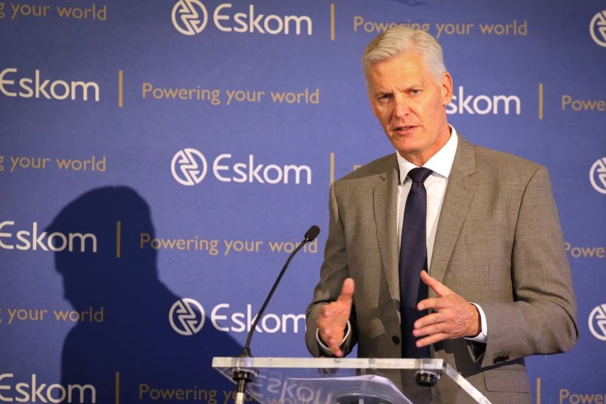
Image Credit: REUTERS/Sumaya Hisham


